Optimised checkout process
Read and implement our tips now!
This article will discuss how you can optimise your checkout process to improve your end user’s experience. There are many factors to consider when you design your checkout page and all the steps leading to your checkout page. However, the main reason you should implement the checkout process’ best practices is ideally to increase your conversion and decrease shopping cart abandonment.
We’ve given our best tips and tricks to help you optimise your checkout process and follow the best practices to increase your conversion.
On this page
Shopping cart checkout
There are many reasons why users abandon their shopping cart and desire a better checkout page. Some of the reasons are:
– Extra costs
– The need to create an account
– Complicated checkout process
– Can’t calculate total order upfront
– Website crashed
– No secure payment option
– Delivery is too slow
– Unsatisfactory return policy
– Limited payment options
Now that we’re aware of why people need a better checkout process, what does the best e-commerce checkout design look like? Unfortunately, there is no one correct way to design a checkout page. However, knowing the nine reasons above for why people abandon their shopping carts is a good way to start.
Keep in mind, though, that there are some things that you can control and some that you cannot. So no matter how optimised your checkout process is, some things are out of your hands.
- Window shoppers
Many times visitors only want to have a look at the products/services you’re selling. For example, they might want to check the price difference between your website and competitors. They can also decide to store items in their shopping cart for future reference.
- Merchant constraints
Shipping and payments are something that you cannot control to a hundred per cent. You should do your best to find several payment solutions that are both secure and demand low shipping costs.
Checkout process’ best practises
Let’s get into the checkout process’ best practises.
Checkout page modification
Three things that a visitor should be able to see and edit once they’ve added products to the shopping cart and have proceeded to the checkout screen are product inventory, product quantity, and product options. This is one of the ways to really optimise your checkout page because if a user wants to edit a product or buy two of the same product, they should be able to do that on the checkout page.
Additionally, if a user edits the quantity of an item from one to two, the final price should also automatically change on the checkout page. Allowing a user to modify their cart in real-time will result in customer loyalty and higher sales.
You must allow the user to delete the product on the checkout page if they’ve changed their mind.
Check out as a guest
Another checkout process’s best practice is allowing users to checkout and purchase their products as a guest. For example, if you’re new to a website and your eyes have caught on to a product you like, you don’t necessarily want to create an account with the website. Instead, you want to be able to have a smooth checkout process where you can checkout as a guest.
Your users will appreciate the freedom you give them with guest checkout. You’re allowing them to checkout with no strings attached, and that’ll improve their user experience and make them want to revisit your website. Once they’ve revisited your website a few times, they’ll most likely create an account and become a loyal customer.
Billing information
Add the billing information section as early as possible during the checkout process. There are two significant reasons why you should take our advice on this.
Firstly, you want the user to write their email address in case they change their mind and abandon their shopping cart. If you know the user’s email address, you can always email them later on.
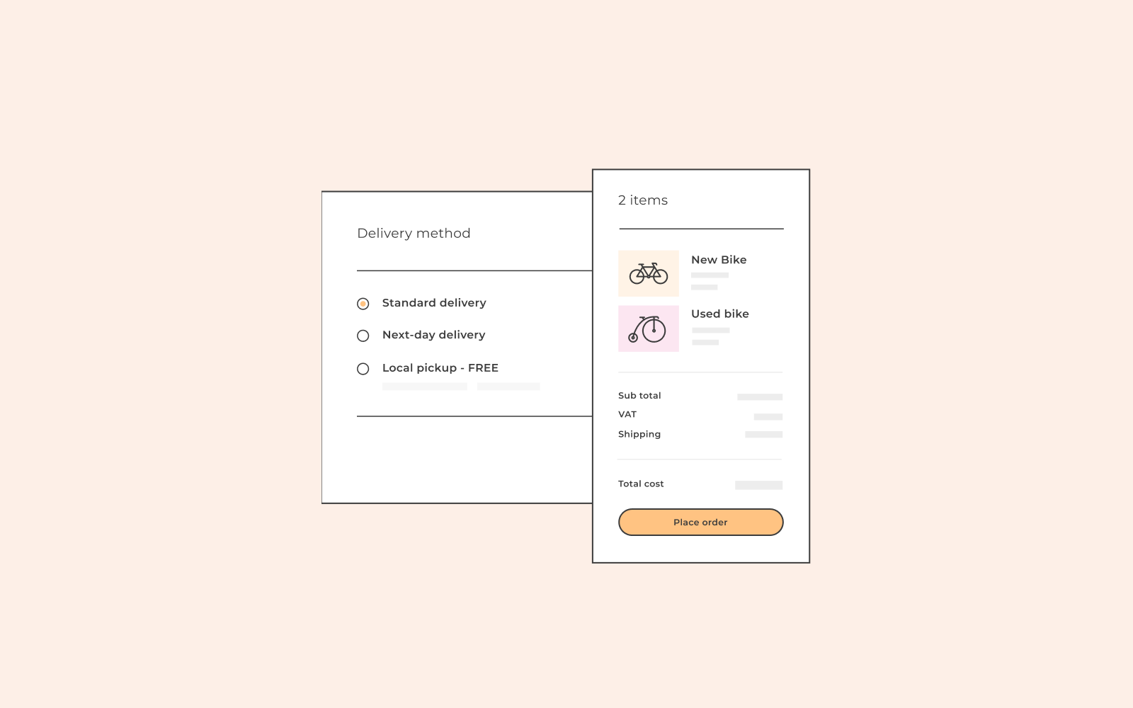
Second, you want to calculate their shipping costs, their tax rate and offer different shipping methods in the next stage of the checkout process. You want the process to be as smooth as possible so that the user and soon to be client does not have to wait for shipping and cost information.
Keep in mind that billing information applies to both physical and digital products as opposed to the shipping section that only applies to physical products.
Limit your questions
Ask yourself what information you really need to attain from your user and what you don’t. The checkout process should be short and straightforward. No one wants to spend 15 minutes buying a product online.
For example, you might not need the user’s company name or phone number. It’s always more lucrative if a user does not have to scroll the page to fill out the information and move on to the next stage. Try to keep everything on the checkout screen to make it easier for the user.
Autofill
If the user is an existing customer, make their life easier. When they arrive at the checkout page, fill out the information that you already have stored so that they don’t have to. It’s all information they’ve given you when they’ve created their account, so you can use it to autofill the fields and improve their user experience.
If the user is not a pre-existing client and you still want to improve their experience, you can use Google Auto-fill’s complete address. Then, the user will start writing their address, and Google will automatically make suggestions in the field.
Secure payment
When buying products/services online, the user takes all the risk because they will pay for the item without it being in their hands.
The first thing you should do is get an SSL certificate to let your users and customers know that your website has a security badge.
Second, make sure to add a secure checkout icon next to the payment. The standard symbol is a lock. This will make users feel better about purchasing a product without having the product in their hands immediately, as we would typically have when buying items at a store.

Visual cues
Use visual cues to guide the user/customer and to improve their experience.
– Use a single column that fits the checkout screen. Otherwise, you’re asking for too much information.
– Use icons to visualise what you need from the user/customer
– Give real-time feedback with a green checkmark letting the user/customer know that the information they’ve written is correct
– Finally, give the customer a short confirmation message so that they know that the checkout was a success.
