
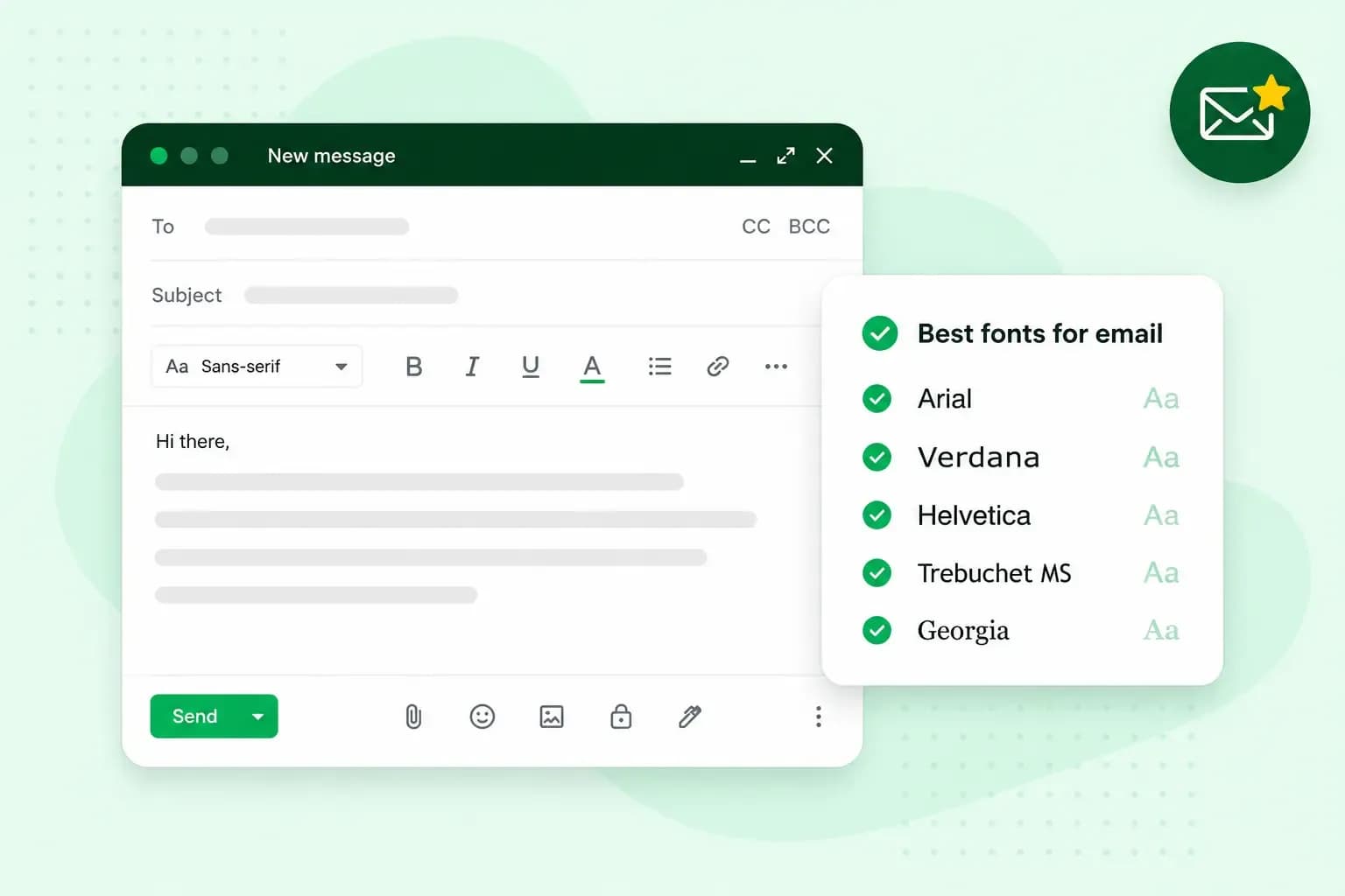
The best font for email is usually a plain sans-serif such as Arial or Verdana. Your reader's computer or phone very likely has these fonts already, so your email arrives looking the way you wrote it.
What are email-safe fonts?
An email-safe font is one that your reader's computer or phone already has. Arial is one of the safest examples, as every major operating system includes it. That matters because an email doesn't carry its font with it. An email only names its font, and the recipient's email client, the app or webmail they read it in, uses that font when it's available.
If the font you picked isn't available, the email client falls back to another font. So a font that looks smart on your screen can arrive looking quite different. With an email-safe font, your reader sees the font you chose in most cases.
The best fonts for email
Arial, Verdana, Tahoma, Georgia and Times New Roman are among the best email-safe fonts, so your reader very likely has them. Helvetica and Trebuchet MS are good fonts too, but they're not on every device, so each needs a little more care.
| Font | Style | Good for |
|---|---|---|
| Arial | Sans-serif | Body text in almost any email, as every major operating system has it |
| Verdana | Sans-serif | Small text, as it stays easy to read at small sizes |
| Helvetica | Sans-serif | Body text and headings, with Arial named after it as a fallback |
| Tahoma | Sans-serif | Compact text, with less space between the letters |
| Lucida Sans | Sans-serif | Body text, if you want an alternative to Arial |
| Trebuchet MS | Sans-serif | Headings, used with care, as not every mobile operating system has it |
| Georgia | Serif | Headings or a more formal tone, readable at different sizes |
| Times New Roman | Serif | Formal letters, as it looks professional |
Serif or sans-serif for email?
Sans-serif is usually the better choice for the body text of a business email, as it holds up better on a screen. Sans-serif fonts such as Arial and Verdana have plain stroke endings. Serif fonts such as Times New Roman and Georgia have small finishing strokes at the ends of their letters.
Our advice: write the body of your emails in Arial or Verdana, and keep Georgia for a heading if you want a more formal touch. The body text stays easy to read, and the heading gets a classic look. Times New Roman is still a good fit for a formal letter you attach as a document.
What font size to use in an email
For body text on a desktop, choose a size of at least 14px. On a phone, text that size can be a struggle to read, so go up to at least 16px there. You write one email for both screens, so if many of your readers open your emails on a phone, 16px is the safer size. Outlook gives sizes in points rather than pixels: 14px is 10.5pt and 16px is 12pt. Gmail's size menu uses names such as Normal and Large rather than numbers, so send yourself a test email to see how it reads on your phone.
Line height, the space between one line and the next, matters too. Give each line some room, so a longer email doesn't feel cramped.
Custom fonts and a fallback
You can use your brand font in a newsletter as a web font. That's a font the email loads from the internet rather than from the reader's device. Only email clients that support web fonts show it. Most other email clients fall back to the next font you name. According to Litmus, Outlook may ignore that list and show Times New Roman instead. So always add an email-safe font after your brand font, and the text still looks clean in most inboxes.
In the email's code, you name the fonts in order, for example font-family: Brandfont, Arial, sans-serif;. The last name, sans-serif, is a general family: if neither font is there, the reader sees whichever sans-serif font their device has. For everyday emails from Gmail or Outlook, an email-safe font on its own is all you need.
How to set your default font in Gmail and Outlook
Once you've chosen a font, set it as your default, so every new email uses it without you thinking about it. In Outlook, the default font is Calibri in black. Calibri isn't on the list of email-safe fonts above, so for emails to customers, Arial or Verdana is the safer default.
Gmail
On a computer, Gmail lets you set one text style for every new email you write:
- On your computer, open Gmail.
- At the top right, click Settings, then See all settings.
- Scroll down to the Default text style section.
- Change the text in the box to the font and size you want for your emails.
- At the bottom of the page, click Save changes.
New Outlook
In new Outlook, the style you pick applies to every new message:
- On the View tab, select View settings.
- Select Mail, then Compose.
- Choose the font, size and style you want under Message format, then select Save.
Classic Outlook
Classic Outlook sets the font separately for new messages and for replies or forwards:
- On the File tab, choose Options, then Mail.
- Under Compose messages, choose Stationery and Fonts.
- On the Personal Stationery tab, choose Font under New mail messages, or under Replying or forwarding messages.
- Choose the font, style, size and colour you want in the Font box. A preview shows each change as you make it.
- Choose OK three times to return to Outlook.
A font for your email signature
The best font for an email signature is the same email-safe font you use in the body, so your email keeps one look to the end. When you write an email signature, type your name, phone number and email address as text rather than as an image. Your reader can then copy them, and they show in your font.
Send and receive email from an address on your own business domain, with ad-free mailboxes and spam protection.
Choose an email planTips to keep your emails professional
A clear font only helps if the rest of the email is easy to read too, in a quick reply to a customer as much as in your marketing emails.
- Skip fancy fonts. Script fonts that copy handwriting can be hard to read, so keep them out of your text.
- Keep to one or two fonts. Use the same font for the whole email, and add a second one only if you want headings to stand out.
- Never send a brand font alone. Without an email-safe font named after it, many readers see a font you didn't choose.
- Give the text some space. Split longer text into short paragraphs or bullet points, so the reader's eye can rest between sections.
- Make the first glance count. Litmus found that readers spent an average of 11.1 seconds on an email in 2016, so a clear font and layout need to get your message across in that time.
Your font and your address
With your font set, every new email uses it. The address you send from is the other thing your reader notices at first glance. With our professional email, you send from an address on your own domain.
Recommended reading
 Email6 Nov 2026
What is email spoofing? How to stop someone faking your business email address
Email spoofing is when someone forges an email's sender. See how to spot a spoofed email, what to do if it's your address and how to stop email spoofing.- Email6 Nov 2026
SPF, DKIM and DMARC explained: how to keep your emails out of spam
DMARC tells mail servers what to do with emails that fail SPF and DKIM checks. See what each record does, how to set them up and how to check they work.  Email10 Nov 2025
How to end an email in English
How you end an email impacts how it is perceived. We have collected the best ways to sign off emails in English.