

Website UX is how easy and pleasant your website is to use for the people who visit it, whether they're checking your opening hours on their phone or placing an order. UX is short for user experience. With good UX, visitors find what they need straight away. With bad UX, they get lost, wait for pages to load or give up on a form.
Good web UX comes down to a handful of principles. You can check each of them on your own website, and you don't need a design team to get them right.
What is website UX?
On a website, UX covers every part of a visitor's interaction with your business, from the first page they land on to the moment they buy, book or get in touch. That route is often called the user journey. Along the way, UX includes how easy the website is to use and whether the content answers the visitor's question. It also covers whether people with a disability can use the website, how fast the pages load and how the website looks.
Usability is one part of UX: how easy your website is to use. A usable website is easy to learn on a first visit and quick to use once a visitor knows it. It's also forgiving when they make a mistake.
UX isn't the same as web design. Design is how your website looks. UX includes the look, but it's also about how the website works for the person using it. UI, the user interface, is the part of the design a visitor actually uses, such as the buttons, colours and layout. Good UI is part of good UX, but a tidy layout can't save a site that doesn't answer the visitor's question. Our guide to the difference between UX and UI goes into more detail.
Why is UX important for your website?
UX is important because visitors leave a website that is hard to use. A good experience keeps them on your website long enough to do what you want them to do. On a small business website, the difference shows in what visitors do next:
- More visitors complete what they came for, such as an order, a booking or an enquiry. Your conversion rate, the share of visitors who do that, goes up.
- Fewer visitors leave, because people leave a website that doesn't answer their key questions.
- Visitors trust a website that works. Clear text, a consistent look and pages that do what they promise make your business look reliable.
- Returning customers find their way again without having to relearn your website.
UX also plays a part in SEO. Google says its core ranking systems look to reward content that gives a good page experience. Its ranking systems also use Core Web Vitals, a set of measures for loading speed, responsiveness and visual stability. Google adds that good scores alone don't guarantee a top position, and that it aims to show the most relevant content even when a page's experience is weaker. In practice, a website that's pleasant to use can help your rankings when plenty of pages answer the same search well. It won't make up for content that doesn't answer the search.
Signs of bad UX
Bad UX costs you visitors, and often the order or enquiry they came for. Check your own website for these signs:
- Menu labels so vague that a visitor can't find the page they need.
- Pages that load slowly, especially on a mobile connection.
- Long forms that ask for more than you need.
- Clutter that buries your main message.
- No clear next step, whether that's to buy, book or contact you.
- Text too small to read on a phone, or buttons too close together to tap.
The core principles of website UX
On a small business website, get these five principles right first. With a website builder, you can build and manage your website without coding or design experience, which leaves your time for these principles. That leaves your time for the content and the route visitors take through it. If you're short of time, start by opening your website on your own phone. A slow page or buttons that are hard to tap can lose a visitor before they see anything else.
Clear navigation
Good navigation takes visitors to what they need without making them think. Keep your main menu short and use the words your customers use, not your internal names. Your key pages should be easy to reach from the homepage, because many visitors go back to it when they get lost on a website. A visitor who has never heard of your business should still understand where each menu item leads.
Navigation also includes the buttons that move people forward. These calls to action belong where a visitor makes a decision. For example, put "Book a table" next to your opening hours, or "Get a quote" after a list of your services.
Readable, uncluttered design
Put function before looks. Give your content room with white space, keep paragraphs short and use headings that tell visitors what each part of the page is about. People scan web pages and phone screens before they read. The words that matter should stand out at a glance. Leave out extra banners, pop-ups and animations that pull attention away from what you want visitors to see.
Accessibility for every visitor
Web accessibility is about making your website usable for people with disabilities, for example people who use a screen reader or a screen magnifier. The Web Content Accessibility Guidelines (WCAG) are the international standard to follow. They have three levels, A, AA and AAA, and AA is the middle one. In the UK, government services must meet WCAG 2.2 at level AA as a minimum. That's a sensible target for any business website too. Start with enough contrast between text and background, alt text for images and clear labels on buttons. Alt text is the short description of an image that a screen reader reads aloud.
A site that works on phones
With mobile-responsive design, your layout adapts to the screen it's shown on. A visitor on a phone then sees your content without zooming in or scrolling sideways. Before you publish a change, open the page on your own phone and try to do what a customer would do, such as booking or finding your phone number.
Fast-loading pages
While a page loads, visitors wait for its content to appear, a wait that's barely noticeable on a fast connection but real on a slow one. Google's Core Web Vitals include measures of how fast a page loads and how quickly it responds, each with a target:
- Largest Contentful Paint (LCP) measures loading. The main content should appear within 2.5 seconds.
- Interaction to Next Paint (INP) measures how quickly the page reacts when someone taps or clicks. It should be 200 milliseconds or less.
- Cumulative Layout Shift (CLS) measures how much the page jumps around unexpectedly while someone is on it. Its score should be 0.1 or less, where 0 means no unexpected shifts at all.
You'll see how your own pages score in the checks below. If they miss these targets, here's how to fix slow-loading pages.
How to check your website's UX
You can run a basic UX audit of your website yourself, without an agency. Work through these checks, starting with the one that needs nothing but your own eyes:
- Use your website as a stranger would and note where you get stuck. Is it clear what you offer and what to do next?
- Look at your bounce rate and conversion rate to see where visitors give up. If you don't measure them yet, start by setting up Google Analytics and marking the actions you count as conversions, such as an enquiry, as key events.
- Check your speed in the Core Web Vitals report in Google Search Console, which groups your pages as good, needing improvement or poor on the three measures above, based on real visitors' data. If your website doesn't get enough visits for the report, test a single page in Google's PageSpeed Insights instead.
- Ask your visitors what they think with a short survey. A heatmap tool shows where people click and scroll on a page, so you can see which parts get attention.
- Test a change with A/B testing: some visitors see one version of a page and others see a second one, for example with a different layout or button. You keep the new version if it clearly works better, and stay with the original if it doesn't.
Once you know where the problems are, you can often improve your website's user experience with a few tweaks. Some problems need more than a few tweaks, such as a website that doesn't work on phones or a structure your customers can't follow. For those, we recommend redesigning your website.
Recommended reading
 WebsitebuilderOct 19, 2026
How to get your website ready for Black Friday (with checklist)
Get your website ready for Black Friday with this practical guide and checklist.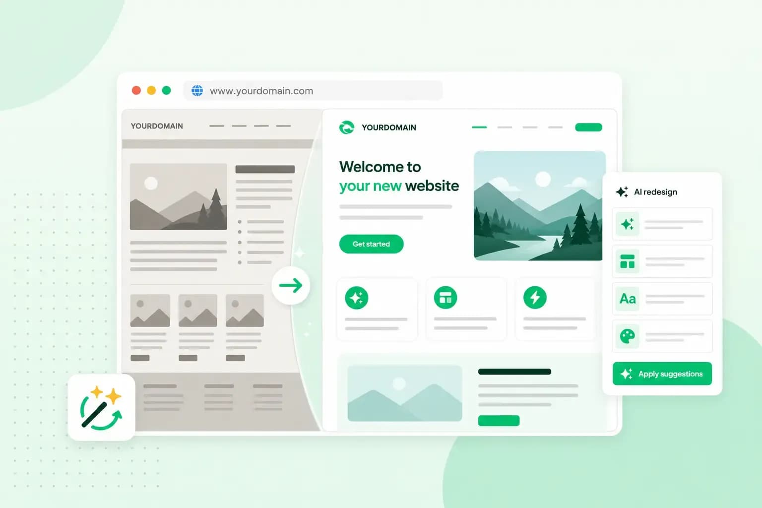 WebsitebuilderAug 31, 2026
How to redesign an existing website using AI
Discover how Aida AI can redesign your existing site in minutes, add new features, and help you create a site that's ready for business.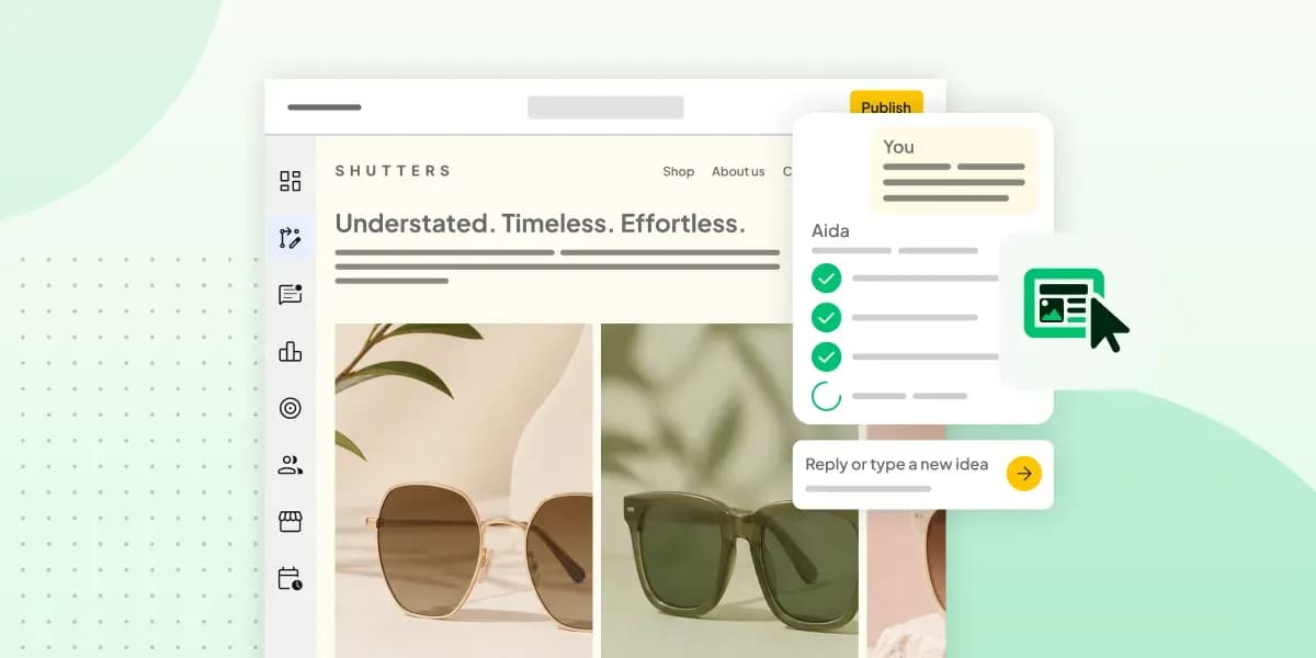 WebsitebuilderAug 11, 2026
How to prompt an AI website builder
Learn how to prompt an AI website builder to create a professional website for your business. Get examples for shops, salons, clinics, and more.