We’ve shared great tips!
We all know the importance of a logo. A logo represents your brand, it almost becomes a part of you, and it’s a way for people to recognise you. So, where to put a logo on your website is a common question, especially due to its importance.
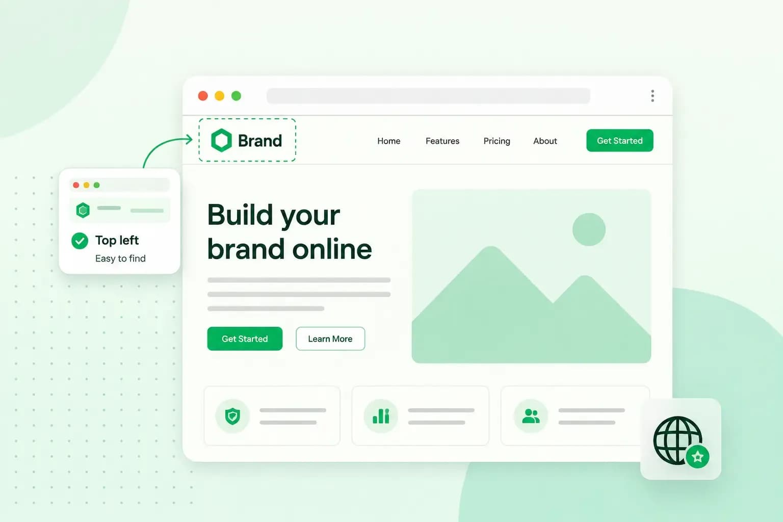
The most common way is to place your logo on the top left of your website. When you place your logo to the top left, it helps your visitors identify which website they’re visiting if they’re just quickly browsing through.
Another reason for it being the most common way to place your website logo on the top left is that we normally read from left to right as native speakers of the English language. This has also been adapted into website design; everything we read is situated from left to right.
Why should you place the website logo to the top left?
Readability, consistency, and user experience are not the only reasons we place our website logo’s top left.
Nielsen Norman Group has recently written a study on this subject. The study has proven that a left-aligned website logo provides several advantages. One of them, which’s not yet mentioned, is that a left-aligned website logo enables easy navigation to the home page. In addition, the study has also shown that when your customers’ scroll to see your products and services, in some cases, the logo follows, which increases the level of brand recognition.
Keep in mind that while the design is essential when you first build your website, user experience is more important. Also, make certain that your entire website is easy to handle, modern, sleek, and that one can navigate your content effortlessly. one.com’s AI website builder makes it simple to position your logo and keep the whole site clean and easy to navigate.
When to break convention
Language
Going back to the point on how English native speakers read. If your website is directed to Arabic-speaking people, you should break the convention pattern of top-left logos. This is because Arabic native speakers read right to left, opposite of English native speakers. This is all in the spirit of improving the end-user experience.
Mobile devices
Hamburger buttons. The hamburger button that is typically placed on the top left on mobile phones is becoming a popular design pattern. The hamburger button allows for easy navigation without too much hassle. All you need to do is click on the hamburger button, and the navigation bar pops up, and you can decide which page to visit next. As we are utilising our mobile phones (even more so than our computers) this design is very beneficial.
Other aspects to consider concerning your logo:
Logo PNG
PNG (Portable Network Graphics) is the best way to have your logo designs delivered. The key factor in a logo that is delivered in PNG is that it does not lose it’s quality when compressed. In addition, PNG supports all colours and backgrounds.
Colour
In addition to considering the design of your website logo, also consider the colour. Remember always to have the user experience in mind when deciding on the colour. Also, contemplate what colour your logo’s background should have.
Tip: Make sure that your colours are aligned. Your logo colour should, in the best-case scenario, match with the rest of your website.
Logo size for website
Don’t overthink your logo size. Your logo should be clear and easy to read and understand. Thus, don’t oversize or minimise your logo size. Keep it somewhere in between; that’s easy on the eyes. You don’t want an oversized logo that might steal attention from the rest of your website or a too-small logo size that makes it hard to notice.
Tip: Don’t cut off your logo! Make sure that your logo is placed beautifully on your website without the feeling of overcrowdedness.
Place your logo everywhere
Besides having your main logo on the top-left of your website, you should place it elsewhere as well. You should place the logo, for example, on images you have published, on your website’s footer, and even in your online shop if you have that. This is all to make sure that your brand comes across and is recognisable.
Recommended reading
 Online MarketingDec 30, 2025
AI SEO: a guide to search engine optimisation with artificial intelligence
A basic guide to AI in SEO – let's look at how artificial intelligence can help you speed up your SEO tasks. Online MarketingDec 30, 2025
Make your website visible in AI searches
A basic guide to AI in SEO – let's look at how artificial intelligence can help you speed up your SEO tasks. Online MarketingNov 11, 2025
What are topic clusters? Their importance for SEO
SEO topic clusters can help you build authority around specific topics and become more visible on Google. Here’s how to create them!