
What is the best font for email?
Send the perfect email today!
You want to send marketing emails to your customers, and you want to make sure that it’s perfect. Don’t just spend time on the content of the email, but also on the visuals. What is the best font for emails? What type of email font will appeal to your users reading the email?
In this article, we’re discussing the best professional fonts you should use when sending emails to your customers and leads.
What are email-safe fonts?
You might have the perfect email font that you want to use. However, when you send your emails, the email font does not look like what you intended. This is most likely because your recipients’ email client does not support your email font. This is why it’s essential to use email-safe fonts; otherwise, the email client will use a fallout email font which will probably not look appealing.
The best email-safe fonts
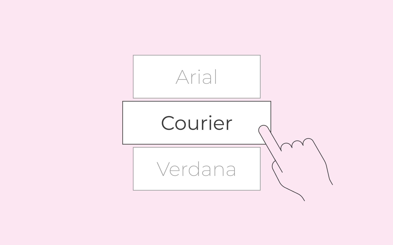
So what are the best email-safe or email-friendly fonts? We’ve listed some font ideas that you can choose from. It’s the list of fonts that you can choose from whenever you’re sending an email; they’re already installed and ready to be used on most email clients. The fonts are:
- Arial
- Verdana
- Helvetica
- Georgia
- Tahoma
- Lucida
- Trebuchet
- Times New Roman
As mentioned above, when you use one of these email fonts, you’re ensuring that the appearance of your email will not change once your recipient opens the email.
Tips to keep your emails professional
You want the recipient to receive professional fonts when they open their email. So there are some aspects that you should avoid to keep the email fonts professional.
- Don’t use fancy fonts. This is a common mistake. Fancy fonts are complicated to read. You must keep in mind that recipients typically only spend 11 seconds on an email. If they see a difficult to read fancy font, they’ll probably ignore the email. Consider readability and clarity every time you choose an email font.
- Don’t overuse fonts. If you’re using different headlines, stick to the same fonts. Use a maximum of two fonts if you must. Otherwise, keep it to one font.
- Use all sorts of spacing to not overbear the recipient. If you have a fair amount of text, try spacing and splitting paragraphs or using bullet points. Let the recipient’s eye rest a bit between each section.
Remember that you have 11 seconds to make an impression. Thus, ensuring that the recipient gets a perfect first glance is crucial. If everything from content to the email’s appearance is appealing, the recipient might finish reading the entire email and even click on the links in the email. So in a sense, you can say that using the best professional fonts can increase your conversion. If nothing else, there’s nothing wrong with applying a beautiful professional font to your emails that’s easy to read.